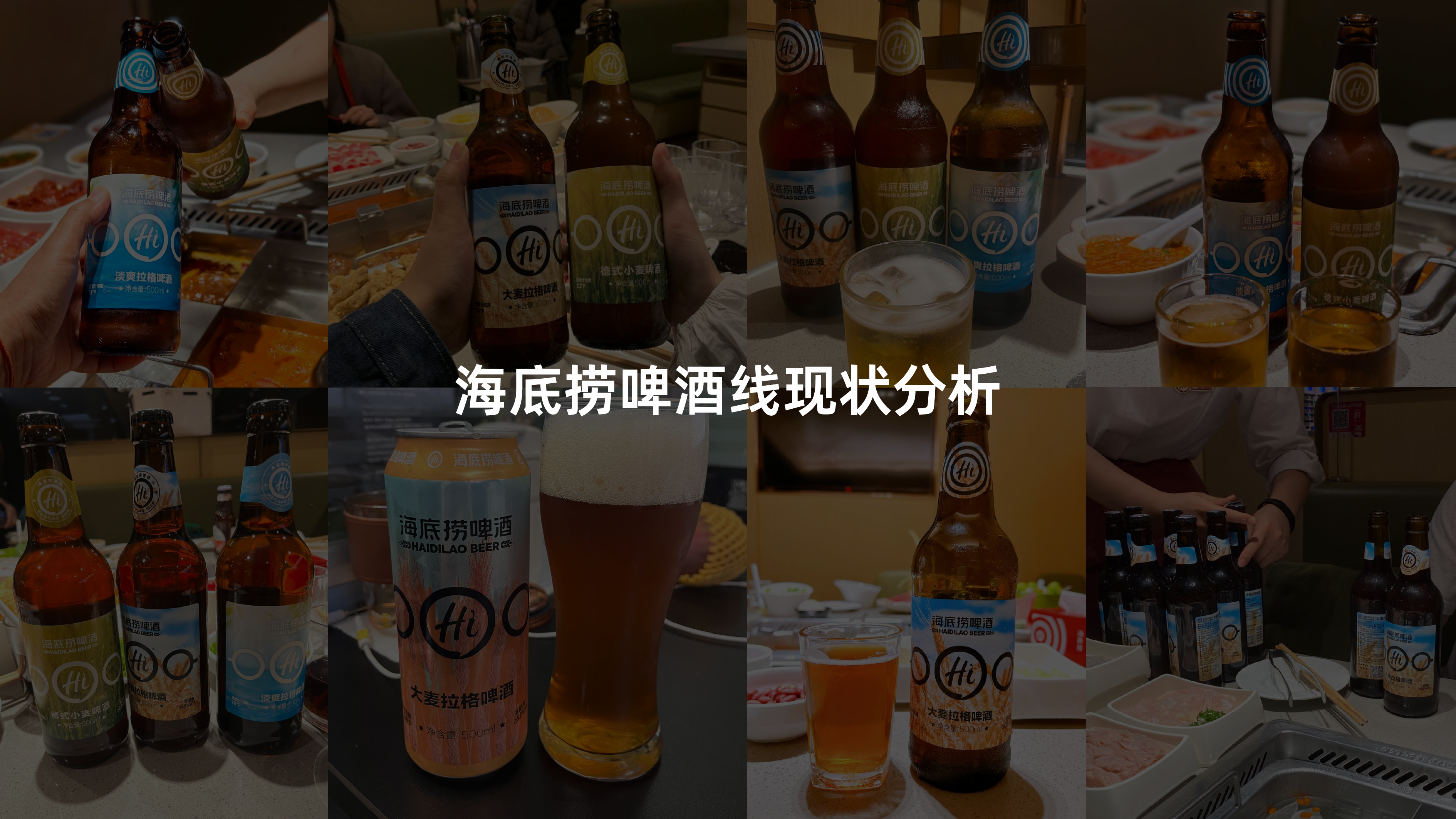
啤酒系列产品包装升级
Client/
海底捞
Date/2024
Team/
设计总监:Mint
创意总监:梁楚豪
视觉策略:梁楚豪 Mint Y8
视觉设计:Mint 梁楚豪
工业设计:Locke
三维呈现:Locke
Service/
作为深耕餐饮领域的代表品牌,海底捞自推出三款精酿啤酒以来,已积累了良好的口碑与消费基础。但随着消费群体迭代与审美趋势变化,产品包装需要进一步升级,以更直观地传递「品质与经典」,强化品牌识别度与话题性,让海底捞啤酒在市场与消费者心智中实现新的突破。
In recent years, the Chinese beer market has shown a trend of consumption upgrade and diversified development. Craft beer has gradually become an important choice for young consumers and urban residents in pursuit of quality and personalized experiences. In the catering setting, beer is not merely a drink to go with meals; it also carries the extension of social interaction, atmosphere and brand value.
As a representative brand deeply rooted in the catering industry, Haidilao has accumulated a good reputation and consumer base since launching three craft beers. However, as the consumer group evolves and aesthetic trends change, product packaging needs to be further upgraded to more intuitively convey "quality and classic", enhance brand recognition and topicality, and enable Haidilao Beer to achieve new breakthroughs in the market and in consumers' minds.
最终我们将设计视觉策略围绕--通过设计将「品质&经典」可视化,打造专属海底捞的精酿啤酒「hi」标,让海底捞符号再一次出圈。
The three classic craft beers of Haidilao have been on the market for about five years and have accumulated a stable consumer base. With the changes in the market and aesthetics, the existing packaging urgently needs to be upgraded and iterated to better respond to consumers' demands for quality and differentiation.
Ultimately, we will design the visual strategy around visualizing "quality & classic" through design, creating a unique "hi" logo for Haidilao's craft beer, and making the Haidilao symbol once again go viral.
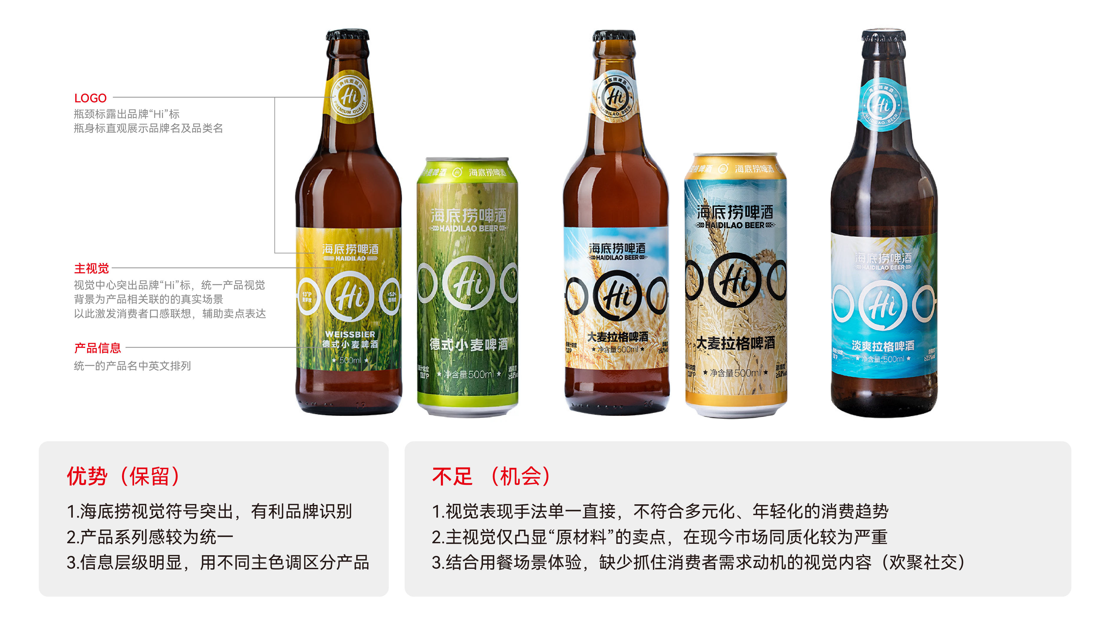
通过设计将「品质&经典」可视化
打造专属海底捞的精酿啤酒「hi」标
让海底捞符号再一次出圈
By visualizing "quality & classic" through design, the bottle shape is designed based on the visual inspiration of "champagne", and the overall visual effect brings a sense of high value, making it easier for consumers to feel that they get what they pay for.